CRISS, CROSS, CROSSINI
Design: Hannes Beer
Illustration: Hannes Beer, Eva Finkbeiner
Type Design: Hannes Beer
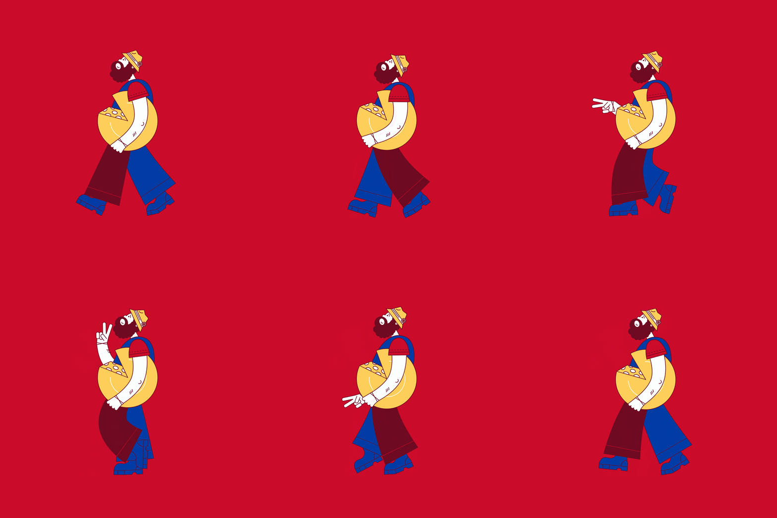
Motion Design: Jule Klemm
HUOBER BREZEL has been baking pretzels in Erdmannhausen since 1950, and is (Southern Germany) still Europe's only lye-pastry maker that has stayed independent and family-run across three generations. The whole range has been organic since 1996, long before that was a selling point. "Organic isn't luxury. Organic is the baseline." A brand with backbone, in short.
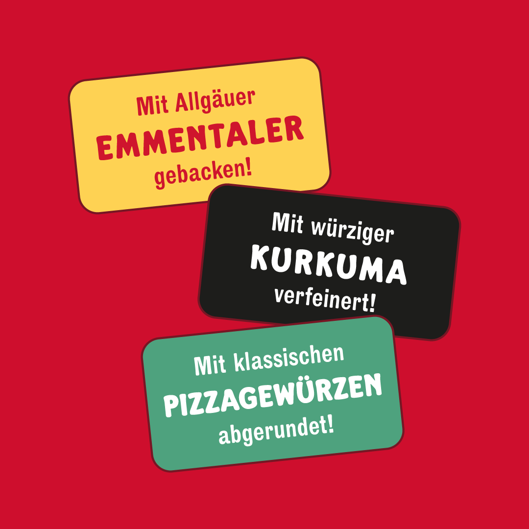
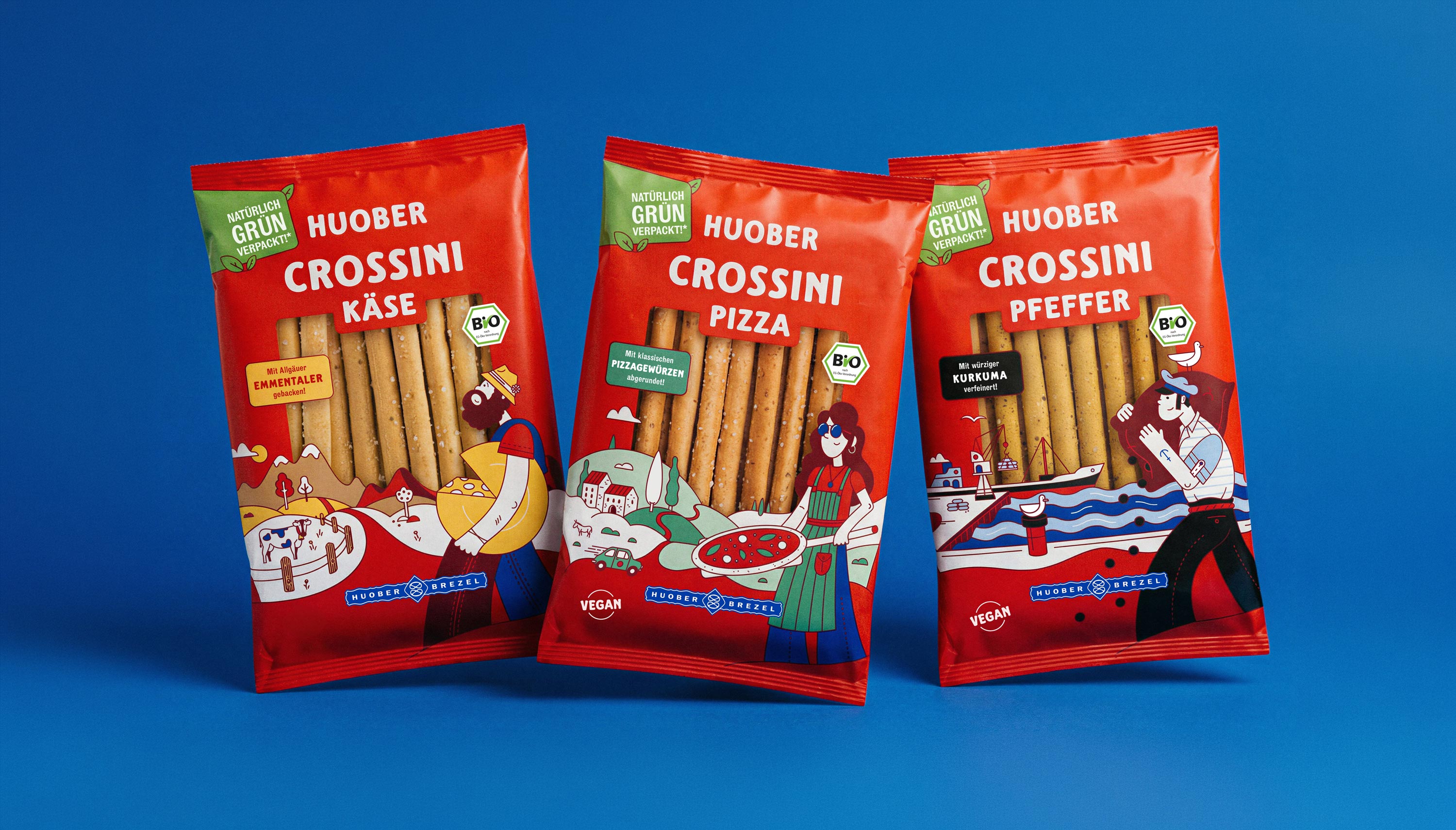
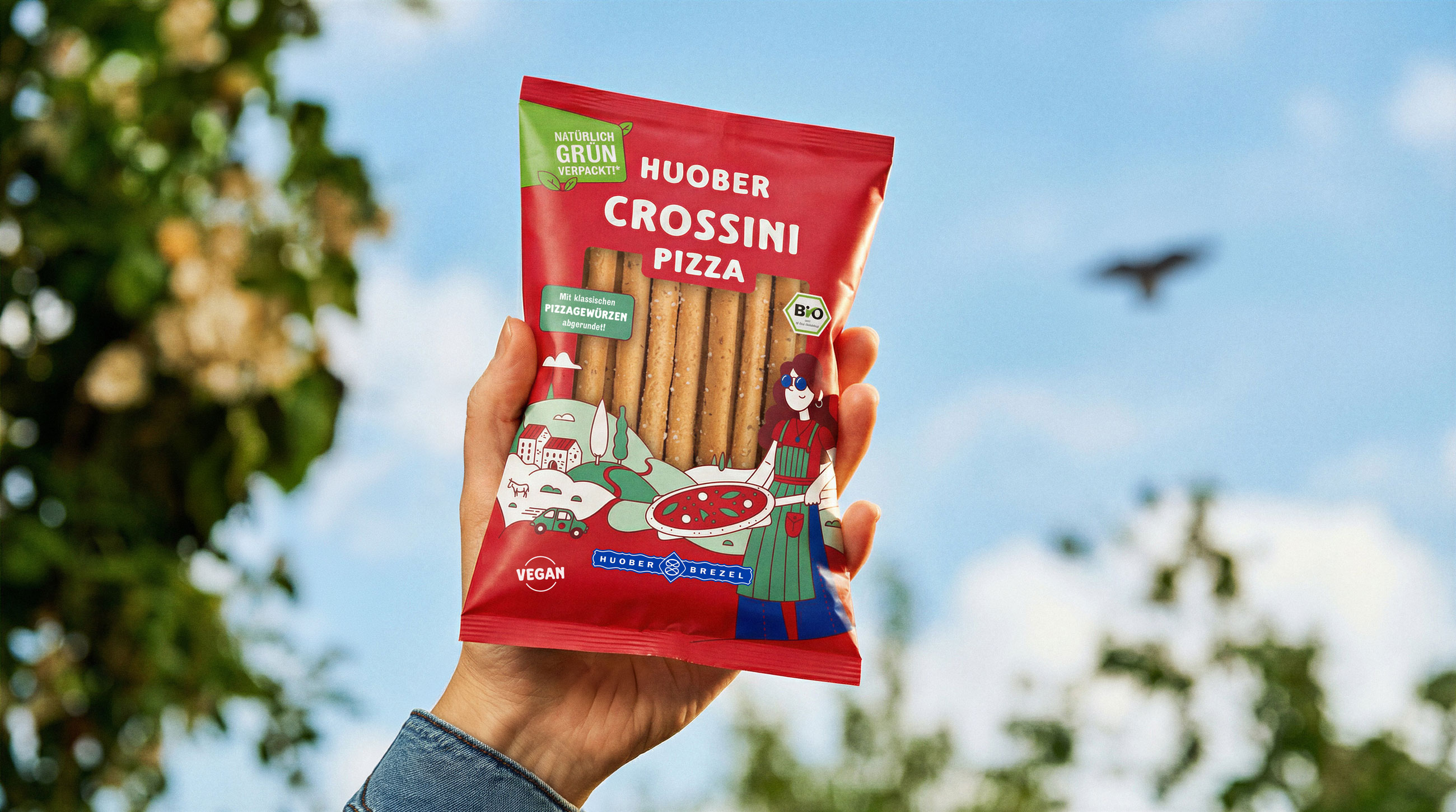
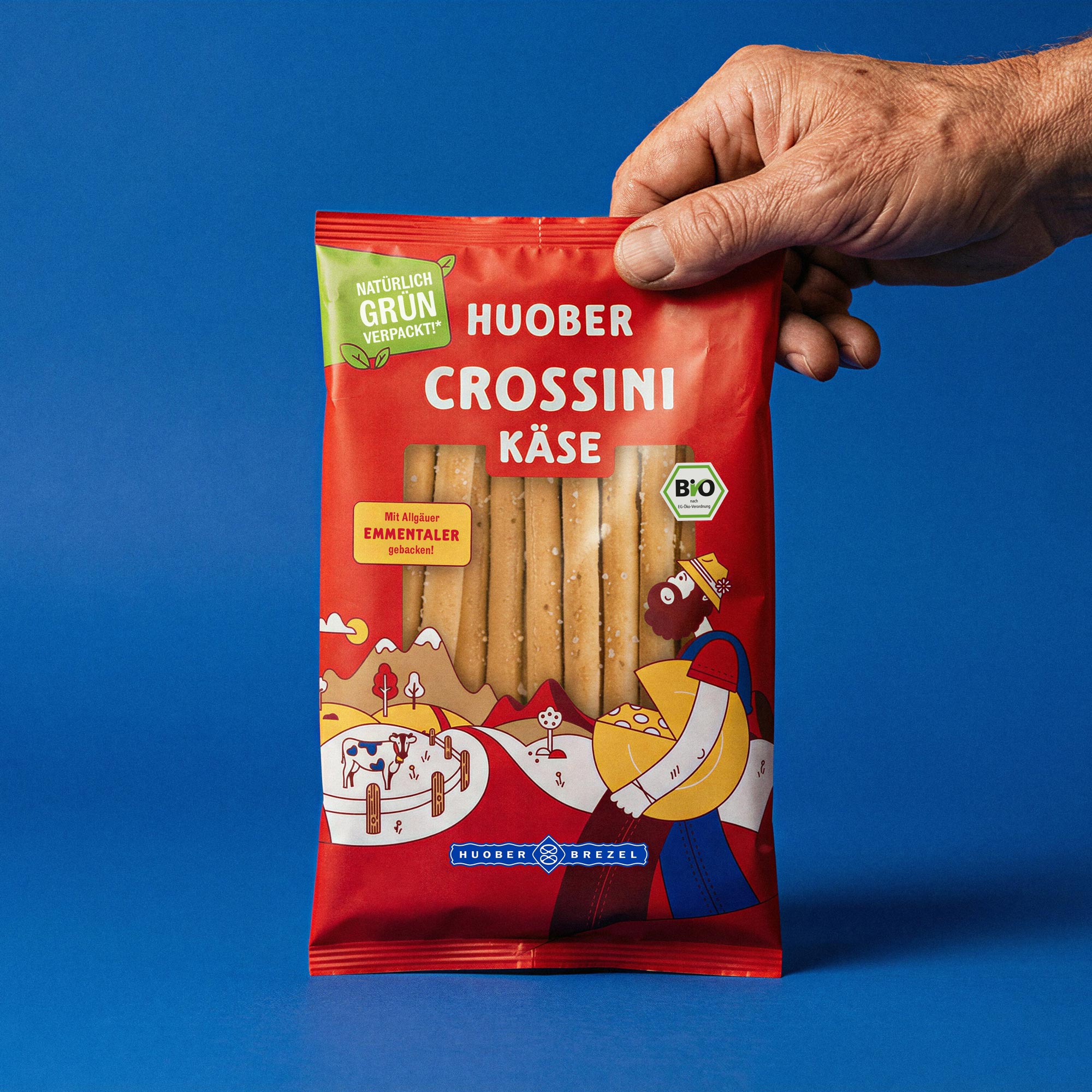
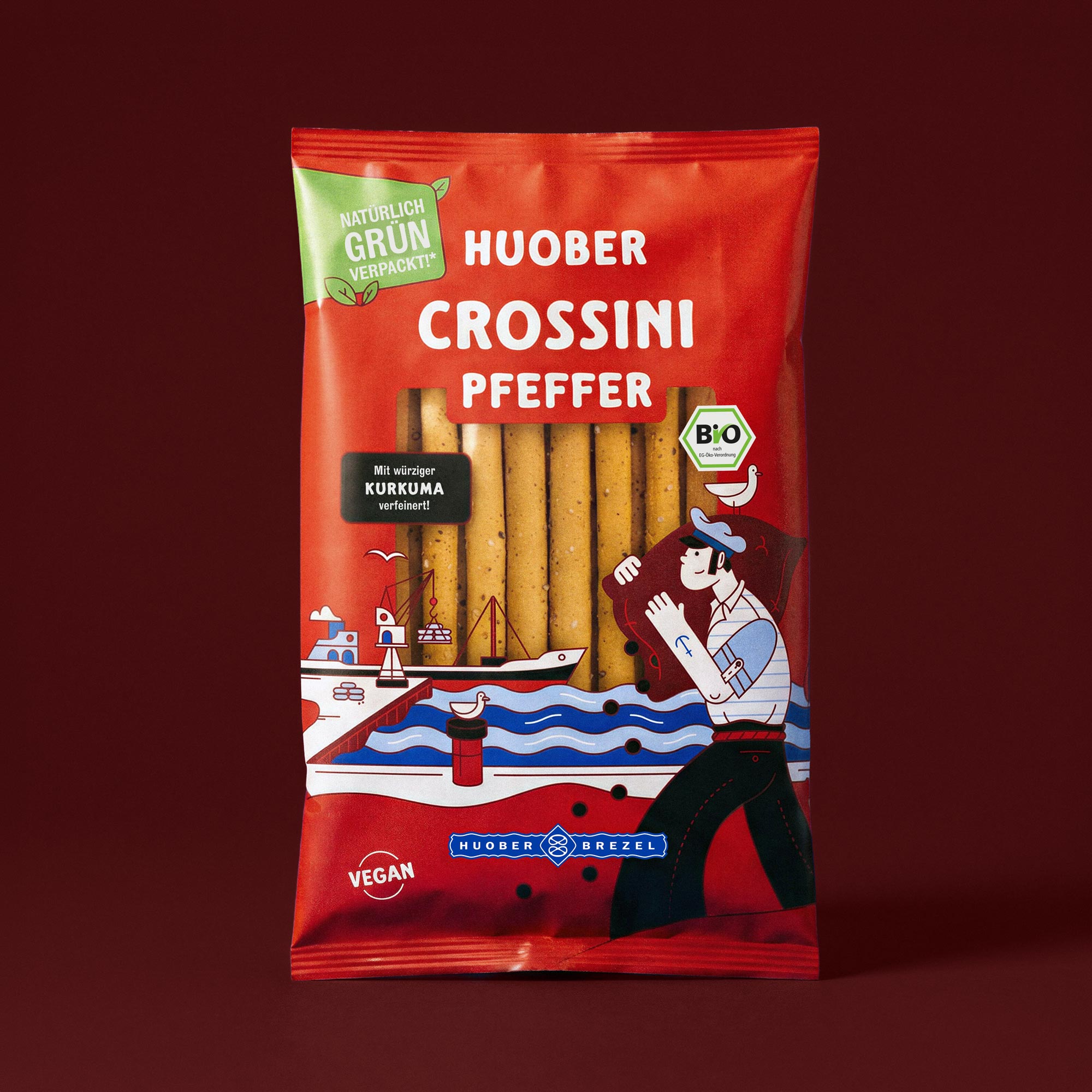
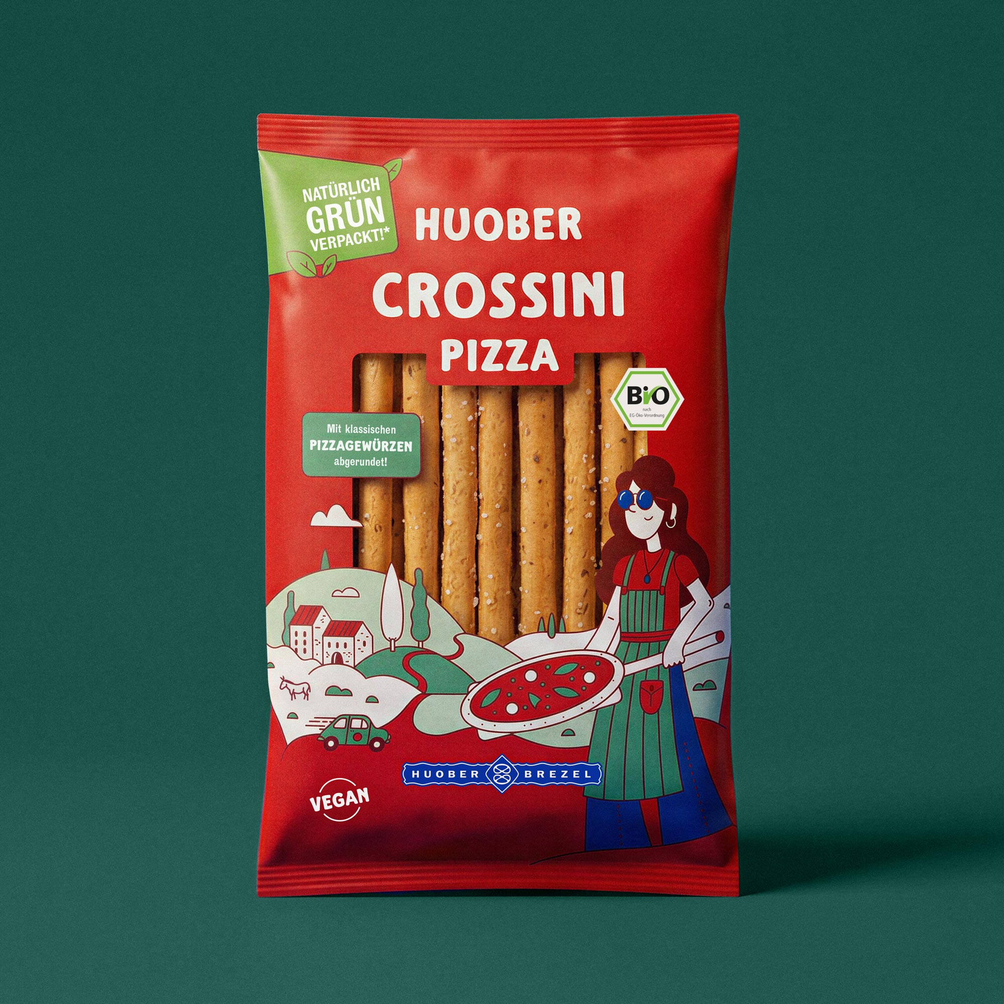
For the new series "CROSSINI", crispy sticks in three flavors, our job was to clean up the packaging design. We built a layout system that gives the pack calm and structure, brings it up to date, and keeps the familiar HUOBER look intact. So the packaging holds its own on the shelf and still reads as HUOBER at first glance.
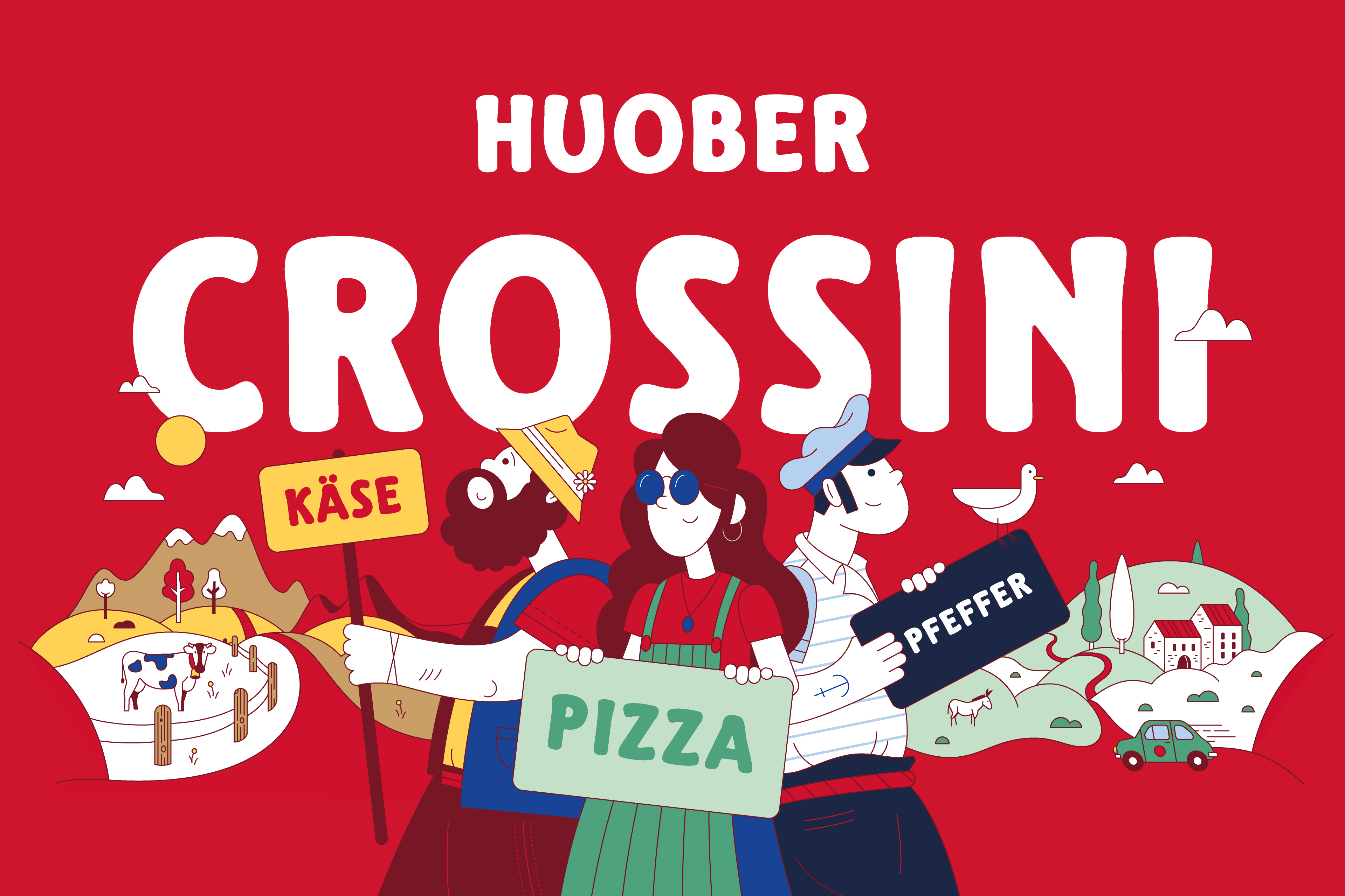
The more visible change came with a new illustration style developed for the series. What emerged is a visual language that pairs the iconographic shapes of the 50s with the slightly psychedelic feel of the 70s: clean, constructed lines, broken up by organic forms, modern and with a nod to tradition. On top of that, we drew a dedicated character for each flavor who, together with an atmospheric landscape, tells the story of its taste. Each variant gets its own face, and the series still reads as a family.
But it didn't stop there: With CROSSINI, HUOBER opened a new chapter, both in design and in production. The series was the first product on German supermarket shelves to use a biodegradable film for snack packaging, a step that fits how the brand operates. The redesign landed so well that the product got picked up across supermarkets and organic stores nationwide, which is anything but a given for a new launch.


ON BRAND, FROM A TO Z
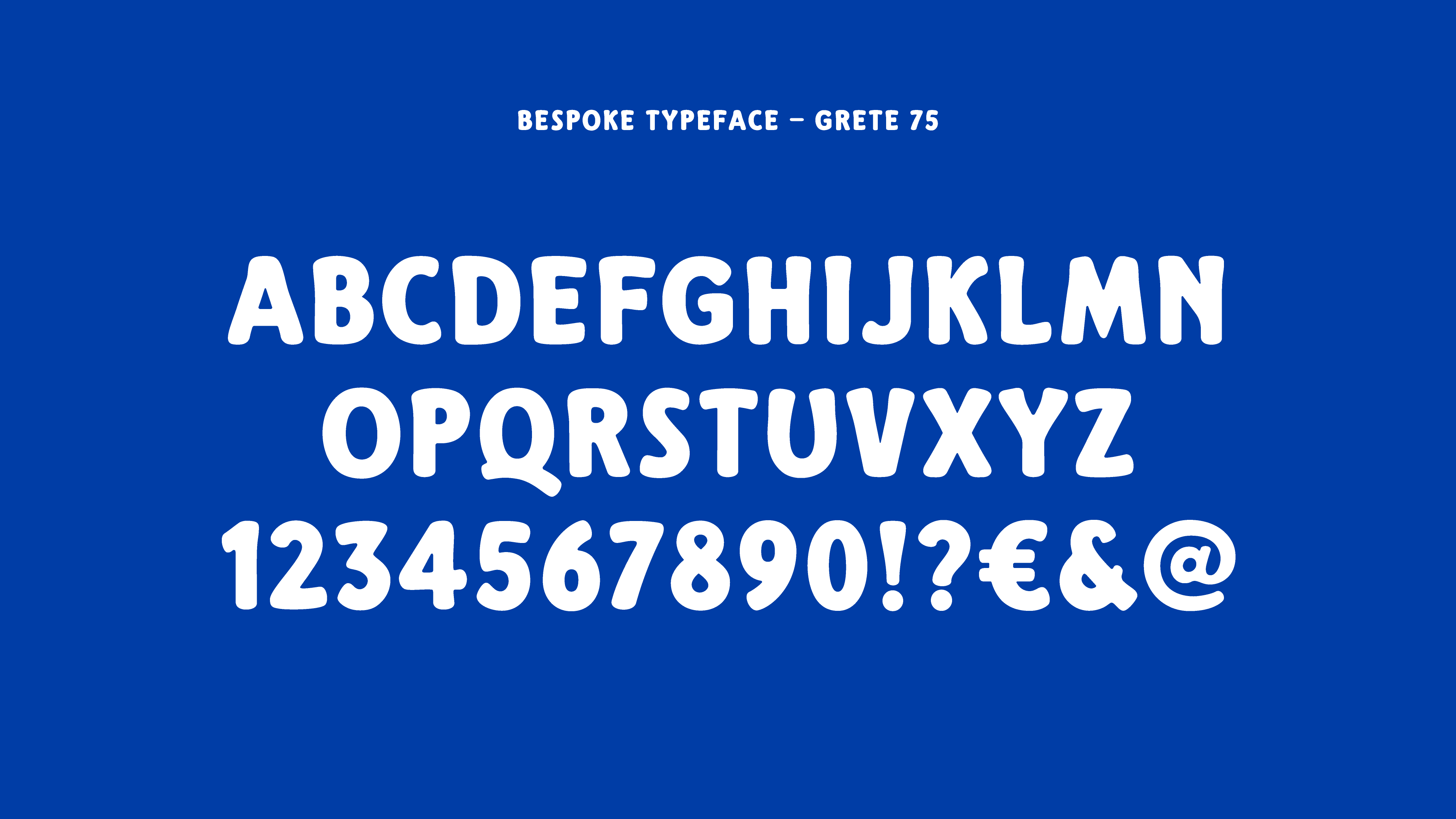
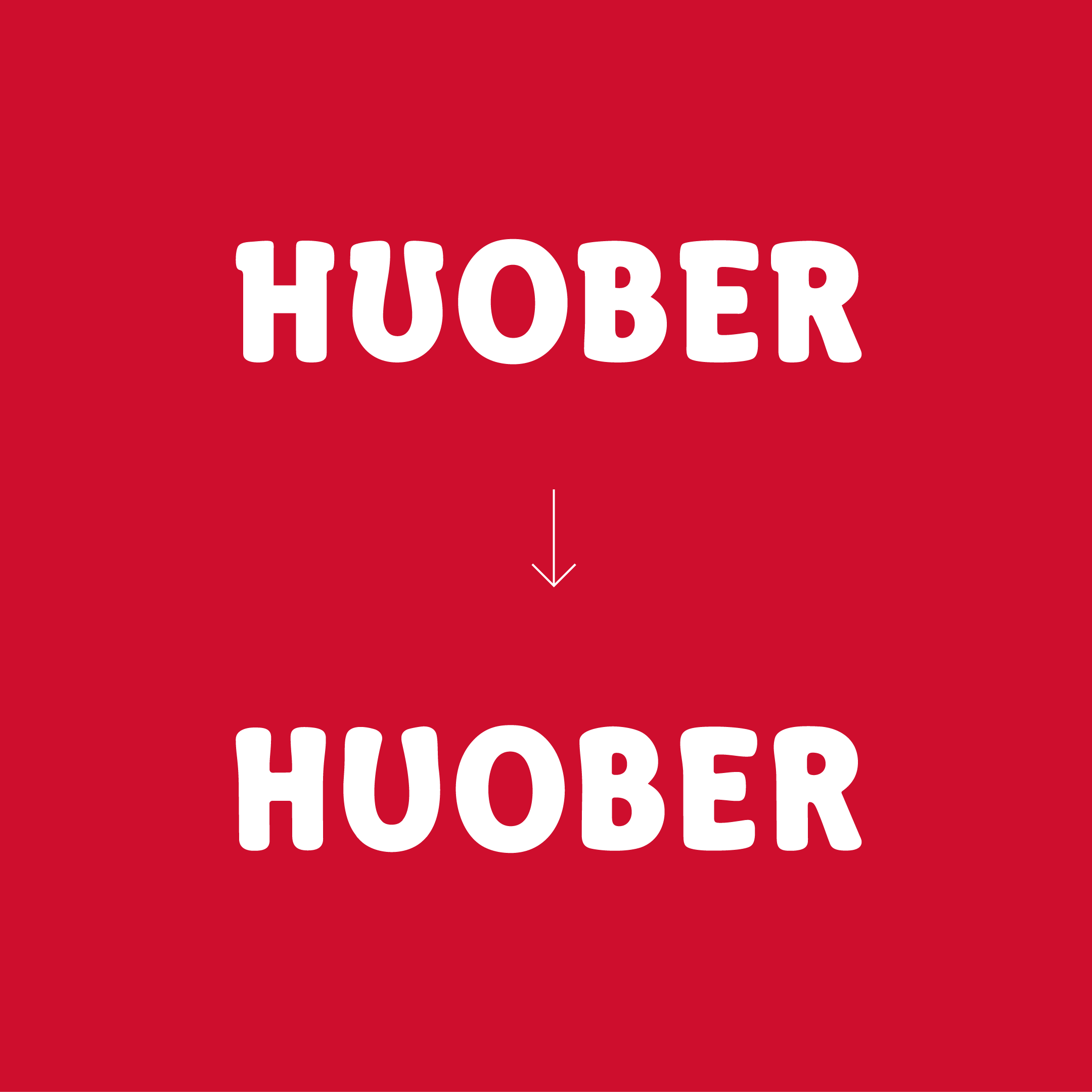
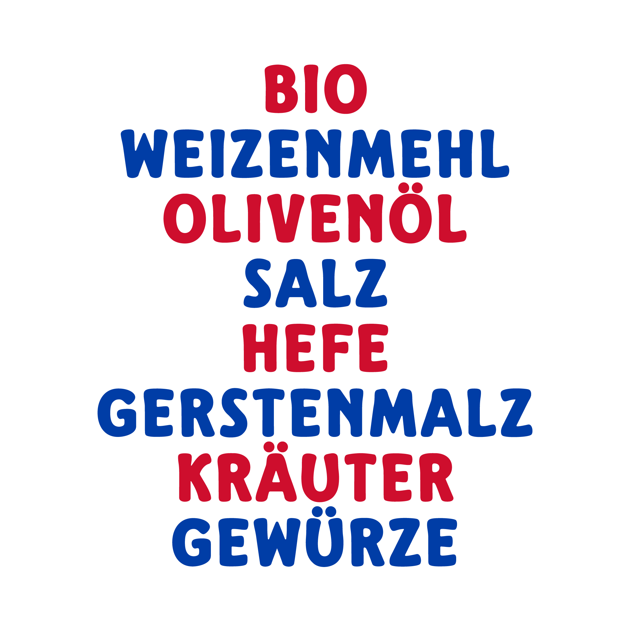
HUOBER wanted to evolve typographically too. The previous house typeface had aged a bit, partly because of its western-style serifs, and didn't quite fit the company anymore. So we drew our own, entirely by hand but based on the existing letterforms, to keep the brand's character and its strong recognition value intact.
We softened and rounded the letters, taking cues from dough fresh out of the bakery. The result is a typeface that feels handmade and human, without losing the brand identity built over decades.
The typeface got the name Grete 75. Named after Grete Huober, wife of founder Emil Huober, who shaped the brand's visual identity from the start and drew the first logo by hand at the kitchen table 75 years ago. A small tribute to the woman who started it all.